Draft:1(543 words)
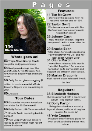
The main concept is a magazine cover for country music that is linked to a website. This fits with the brief since it needs to be an independent publisher and country music fits with that since it got quite a niche audience. Since the audience is quite niche the representations are going to be positive, as well the views and ideologies of the brand will be like the audiences. I plan to use my dad for the main cover with a mid-shot which is quite common for country music magazines. For the inside I plan to use both genders since it will match with the core values of diversity (diversity is shown through my dad and me since we are both Romanians.) Stereotypical props and clothing but as well as casual clothing which matches the country feel.
On the home page I was thinking of doing something like Maverick but with a different colour palette. Since there aren’t many country music websites that also linked to magazines, I got only two to get inspiration from. The colour palette is either red with white or just white and black, for country music. I was thinking a beiger colour with shades of brown for mine since I really like the more neutral colours. The social media is going to be at the footer at the bottom. Both web and social media will attract the target audience since they are young adults and teens, and they would know how to buy from online and how the website is linked to social media. Social media is mainly where the audience are most likely to interact in the comments section however on the website where the reviews are that's where the audience can also interact and give their opinions on the topics. The features the website will have been the little illustrations/drawings that are unique to the website, this will appeal to the audiences because it is visually nice to the eye, since both maverick and country music people are very simple in design I don't want mine to be simple, I want the website to have welcoming personality. The thing that will keep the audience hooked I hope will be the lexis and how I word the articles and everything, since I want to use a friendly approach while also informing them about the artists/ news/ tours etc.
Synergy and branding are important to media industries because if everything is linked to one another then it's easier to promote and sell and show the brand. The magazine is part of advertising and if it's linked to the website then the website is linked to the social media and vice versa. Which gives a boarder marketing and audience as well.
The typeface and logo are going to be the same all around, to show consistency of the brand. The images are going to be similar to the ones on different products. The illustrations on the website will be unique. If the brand got a social media page this links with the young people doing cover songs of their favourite artists, as well as interaction between the audience. The synergy will be shown through the logo as well images and the link to the website from the bio.


No comments:
Post a Comment