


I forgot to screenshot from the begining for this magazine, but i did change the photo to this one and added more text. I added more artists in the Features and then added the main coverline. I changed the photo again since this photo is not in focus which is really sad since it was a really good photo.

I edited the photo to have a monochrome background using photoshop. Then i moved the photo into indesign and moved the main image in the background.


I added two more cover lines and changed the size of the text to a smaller one since the text was too big. I added the date and the barcode with the price. The font of the date is a sans serif font, I also added the website on the front cover however, I will change the size of the text to a smaller one and then changed the colour of the cover lines to white.


-------------------------------------------------------------------------------------------------


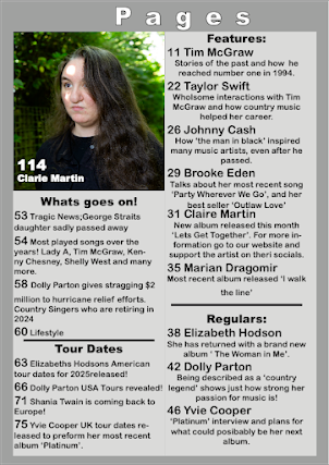
I edited the photo, by doing the exposure a bit lower, and then saved it as a png, placed it in InDesign and then made boxes to help with the layout for the contents pages. With the type tool i added the headline of contents pages on top of the pages going across both of them. I used a sans serif font for the text and made the kerning bigger so the letters are more spread out.
-----------------------------------------------------------------------------------------------------


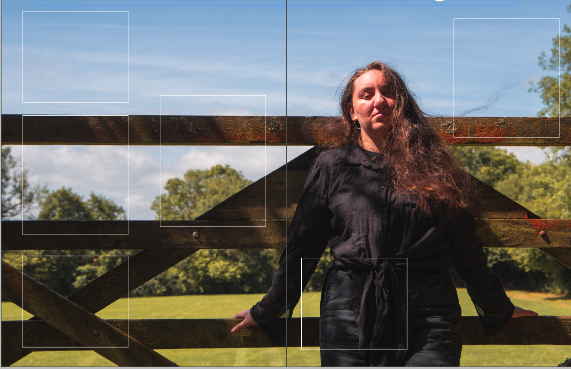
I added a new model for the other contents pages, with low key lighting so it matches the black and white front cover. I then added other photos for the contents pages, instead of a white boarder i decided on a brown one so that it fits the colour palette of the photo better. I need to add text and think about the lexis. 


I made the other front cover by placing the an image of Yvie and then copying the text and pasting it on the other cover. Then i searched for the same font i used for headline so i can change it to Yvies name and then did create outlines so i can stretch the text down. I added a news cover line and also changed the tagline so it matches with the main photo. I later changed the main image to one that we took in the studio, since I'm going for a more mainstream magazine.


Here i made three album covers to put on the magazine cover. The black and white album cover was inspired by Johnny Cash albums, same with the name of the album. This will show intertextuality. The next album, is just country music in general, which is why i think the guitar shot is the best for this cover. Lastly the last album cover is inspired by Shania Twain 'the woman in me' Its not a close up of the face but it is a woman on the cover. I used a bubbly serif font since its more feminine. And a fancy script font for the general since thats the convention for general country music. For the black and white album i used a serif font that looks similar to what Johnny used. Then i added these album covers on the magazine cover as a puff, with the circle tool i made the sticker and then changed the colour to white but then did it orange to pop. Then I started writing the content for the contents pages, I had a music magazine next to me to take inspiration from it on what i need to put and how to word it. I used a sans serif font for the writing so that its easier to read, I scaled up the subheadings as well as the page numbers. Whereas the other text is scaled down. I added the album covers inside the contents page as well and put a page numbers for them. Added page and subheadings for the pictures to show that the magazine has 112 pages roughly. Then i copied and pasted the content on the other contents pages for the black and white magazine.


This is the final draft of product one. I corrected some of the lexis and my wording where it didn't make sense. I didn't really tweak much at it, I did get rid of the text outline so that there wasn't any, since in the past the colour of the text was brown I forgot to change the outline of the text so it was still brown. But I changed that and now i am happy with the outcome. The contents pages look so much better, the three image rows look like a main stream magazine which is the look I was going for, and the other contents page with all the content on it, the lighter grey box which has all the text inside it, is a nice touch of detail. I proofed read it again and made minor changes to the spelling where I spelled things wrong.


here i changed the contents on the contents page because it matched the other cover. I did some research on whats going on and tours that are happening this year.

